Artem Gorokhovsky
Senior Product Designer
0   /   100
Senior Product Designer

Svoe Rodnoe

Scroll Down
Role
Senior Product Designer
Start
Aug 2020
Finish
Feb 2022
Website

About the Platform

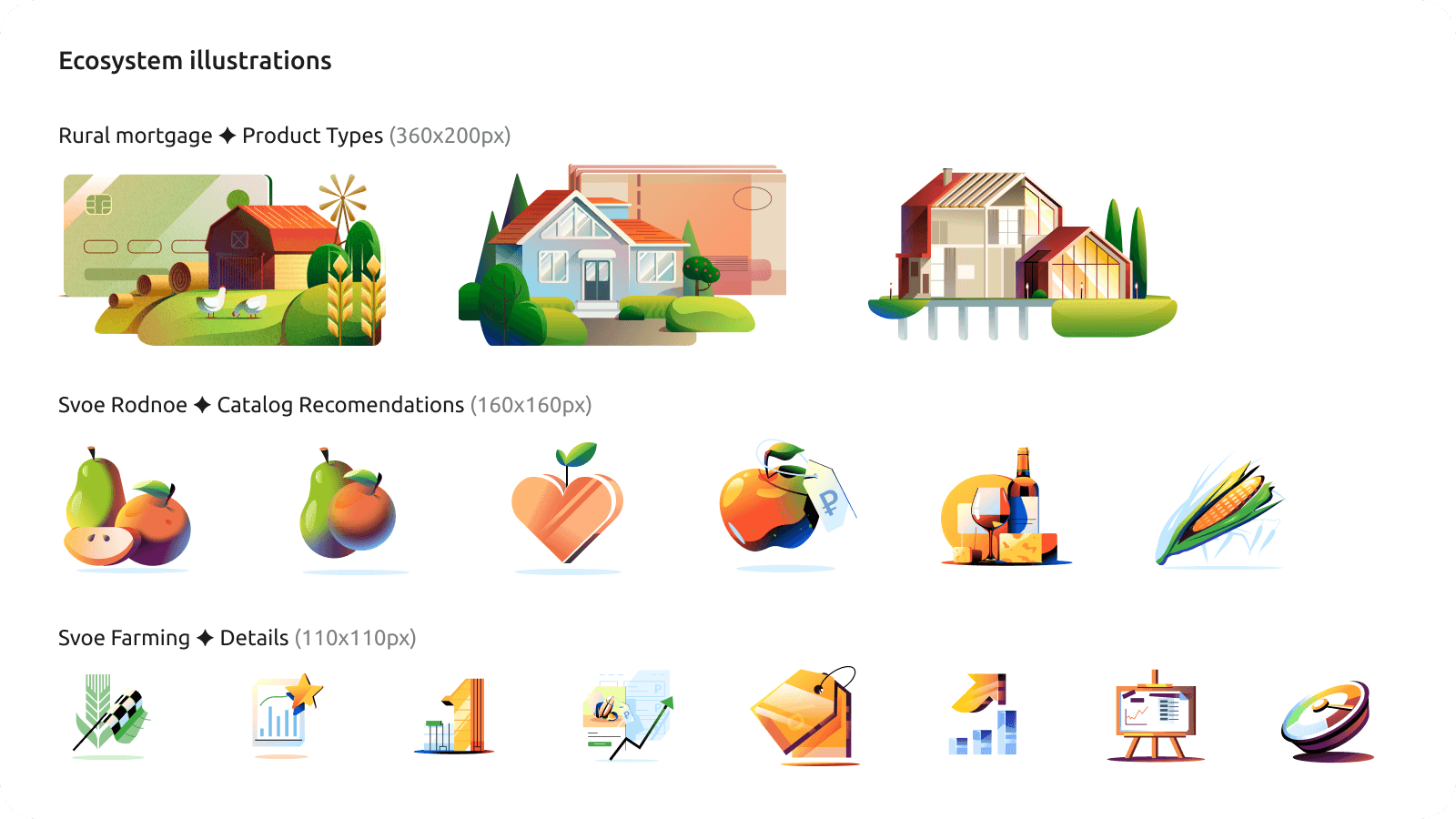
I joined as a Senior Product Designer on a new B2C project — Svoe Rodnoe, a marketplace connecting farmers directly with customers. Farmers could sell their products without retail markups or complicated terms, and buy everything they needed for their own farms, from seeds to combines. Customers, in turn, got organic, high-quality products straight from the source. Design-wise, it was just me and Katya, a senior designer in her own right. Our first task: a logo and the baseline visual rules for the product.

Problems

Fragmented Ecosystem

Each of the bank's product lines — farming, housing, agritourism — ran as its own team, with its own visual language and no shared direction. Svoe Rodnoe was meant to become the ecosystem's flagship, but there was no ecosystem yet to anchor it to.

No Design System

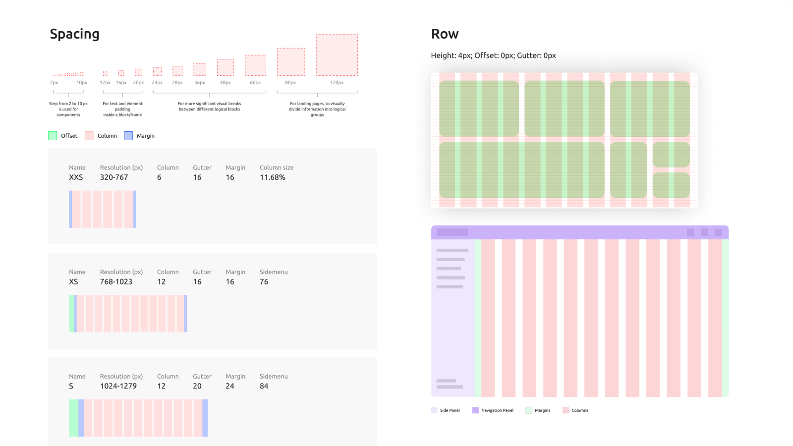
Most products had no real design system, just scattered, one-off UI decisions. Every screen was built from scratch, with no shared components or rules to speed up production or keep the experience consistent across the bank's products.

Disconnected Teams

Teams worked independently and rarely synced with each other, driving production costs up. Engineering saw the lack of coordination as unnecessary complexity, and pushed back on a setup that made ongoing maintenance harder than it needed to be.

Getting Organized

Research & Metrics

Katya and I quickly got in sync, setting up regular check-ins with product teams to shape our first research questions and figure out what metrics we actually needed. While I focused on design infrastructure, she went team to team, piecing together existing data and findings — context we simply didn't have when we started, and needed before we could make real decisions.

Design System & Dev Sync

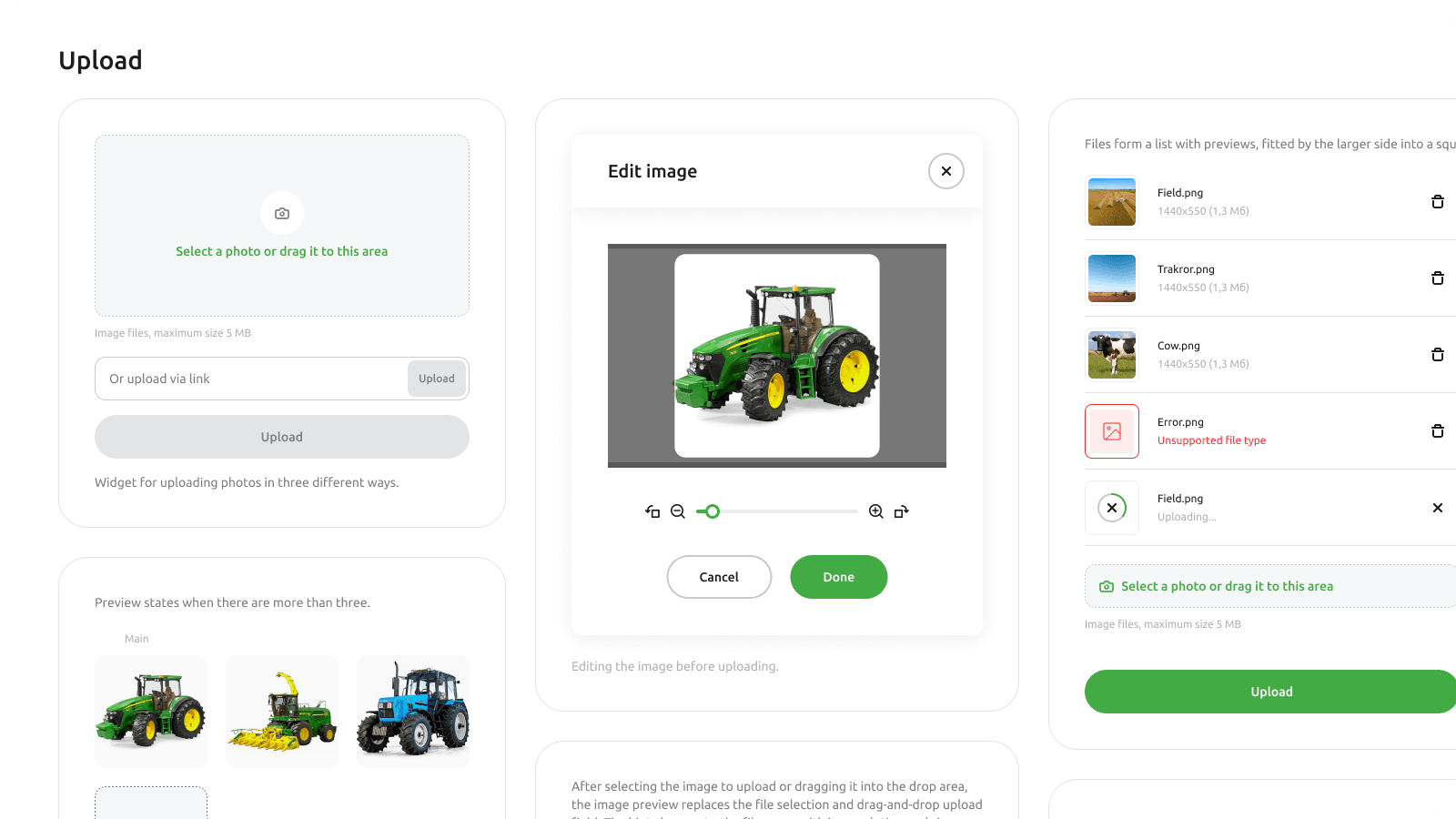
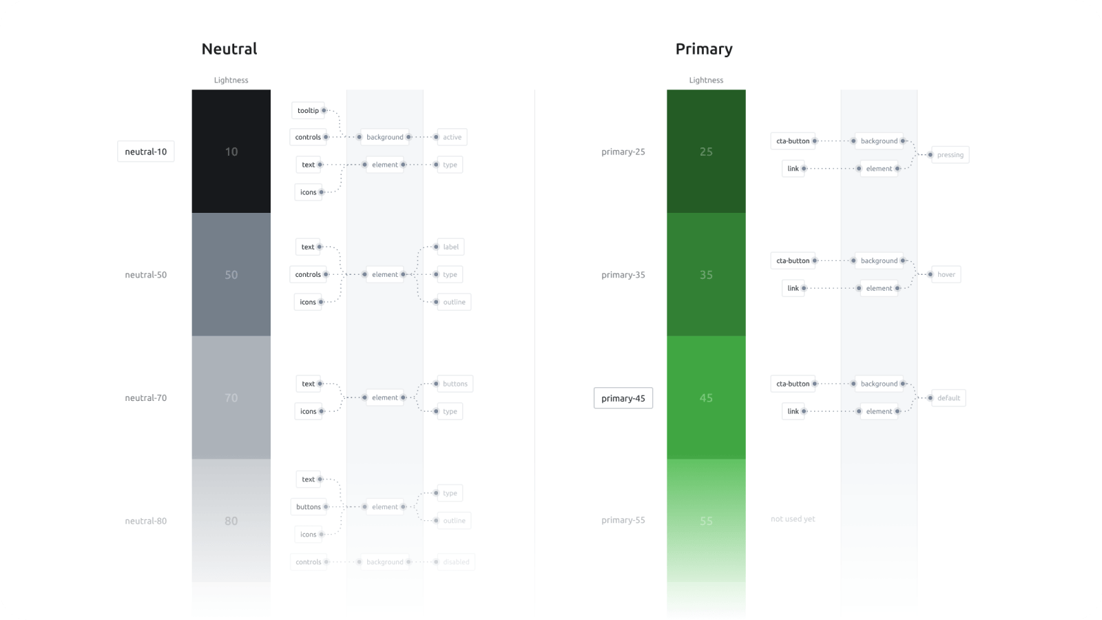
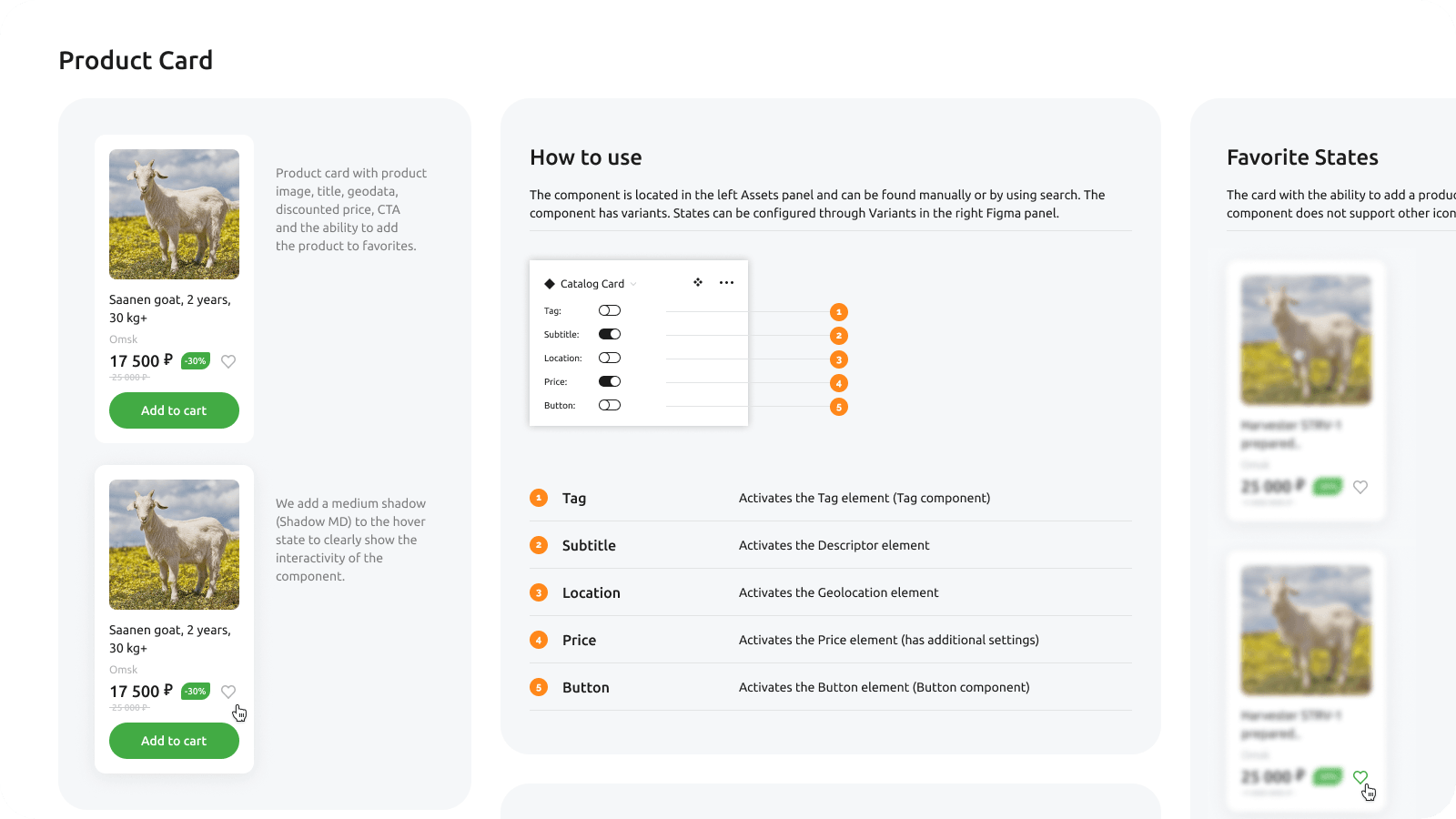
In parallel, we agreed with engineering that the product needed a real design system, with Storybook as the source of truth for component quality. I built the core components and ran regular syncs with other teams' designers to keep everyone on the same page. Reviews happened against live code, not Figma files — a shift that changed how engineering saw design.

Splitting the Work

We split ownership to work in parallel, syncing regularly to stay aligned. My scope covered the homepage, catalog, product pages, and farmer profiles, while Katya took the personal accounts, checkout, and blog.

The homepage worked as a landing page, its job to route visitors toward their key jobs-to-be-done. Stylistically, it stood apart from the rest of the product, while staying built on the same shared visual assets.

32
First-purchase activation

Catalog

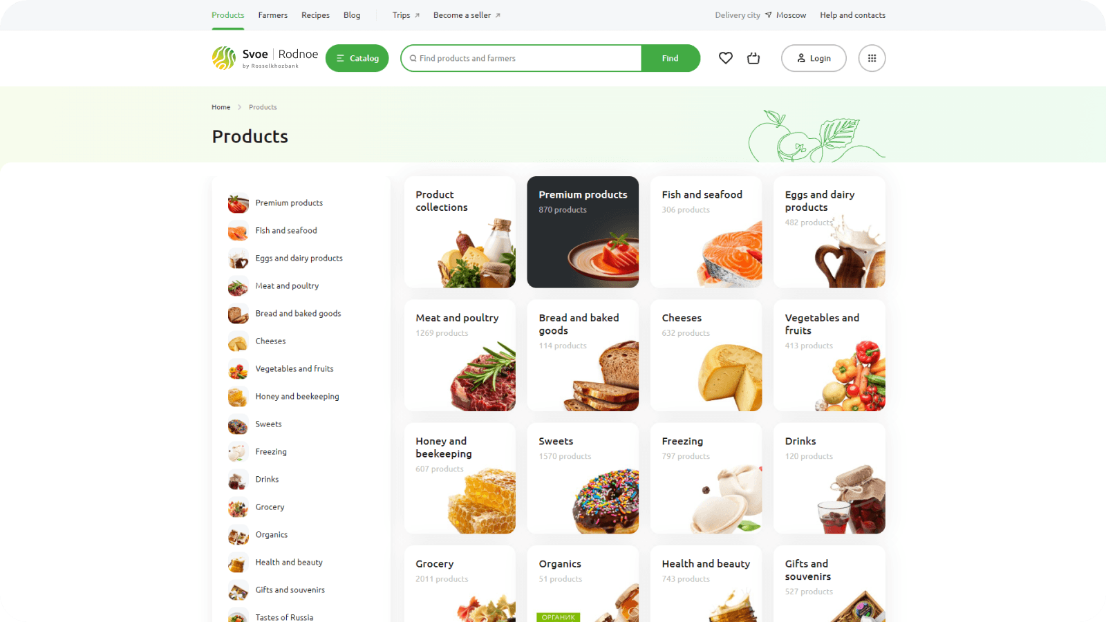
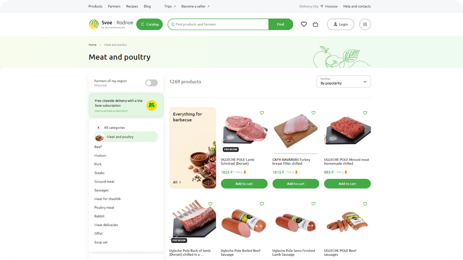
I looked at a wide range of solutions, from direct competitors to ecommerce at large, and landed on a classic structure — familiar left-side navigation into categories and subcategories. The first iteration of the listing stayed conventional, focused squarely on the product itself.

As we dug into behavior and metrics, a clear pattern emerged: people rarely stuck to one category. Buying habits clustered around personal preference or occasion — patterns a static, taxonomy-first structure was never built to capture in the first place.

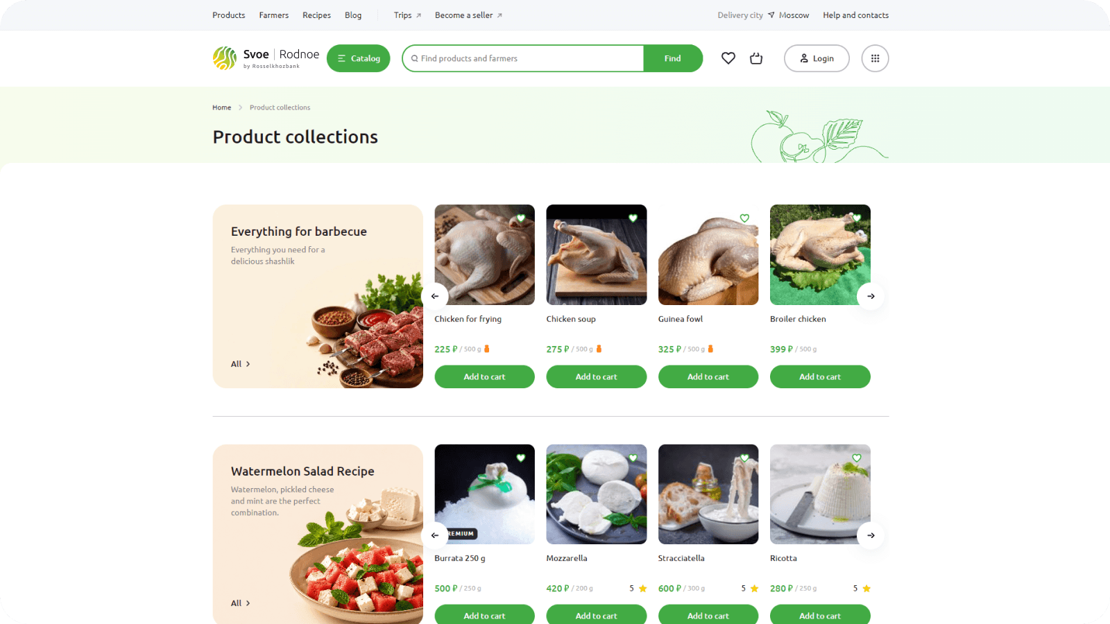
That pattern shaped a new format — curated collections built around how people actually shop, replacing static categories entirely.

In practice: protein-forward bundles for regular shoppers, and seasonal sets like barbecue cuts — marinated and plain — grouped the way people actually cook.

50
Click-through conversion

Closing the Media Gap

The catalog structure was straightforward. The real blocker was media: most farmers photographed products on their phones, and the results rarely did them justice — hurting how professional the catalog felt, and by extension, the whole platform.

I'd already shot product photography and owned a camera and softbox, so I started visiting farms myself — fixing the photo gap and opening a direct line to farmers for future research. It became something more valuable than better photos: real, hands-on trust.

2500
Photos shot
50
Farms visited

Product Page

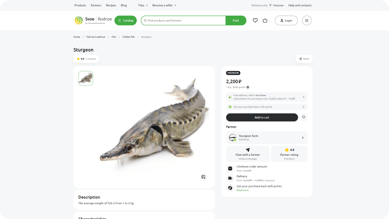
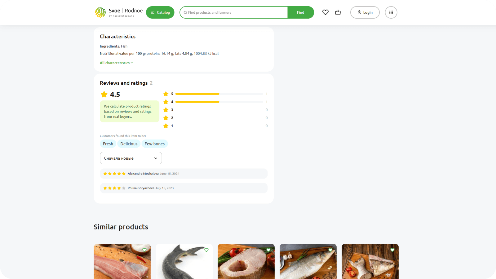
The product page needed to stay simple and informative. Research showed our core audience wasn't just fitness-focused users, but anyone who cared about what they ate.

That insight shaped the layout: we surfaced protein, fat, and carb content directly on the page, in a clear, visual format, instead of burying it in a spec sheet nobody reads.

Feedback also surfaced a clear ask: direct contact with farmers. People wanted to visit farms themselves or know when the freshest batch arrived, so we added farmer chat.

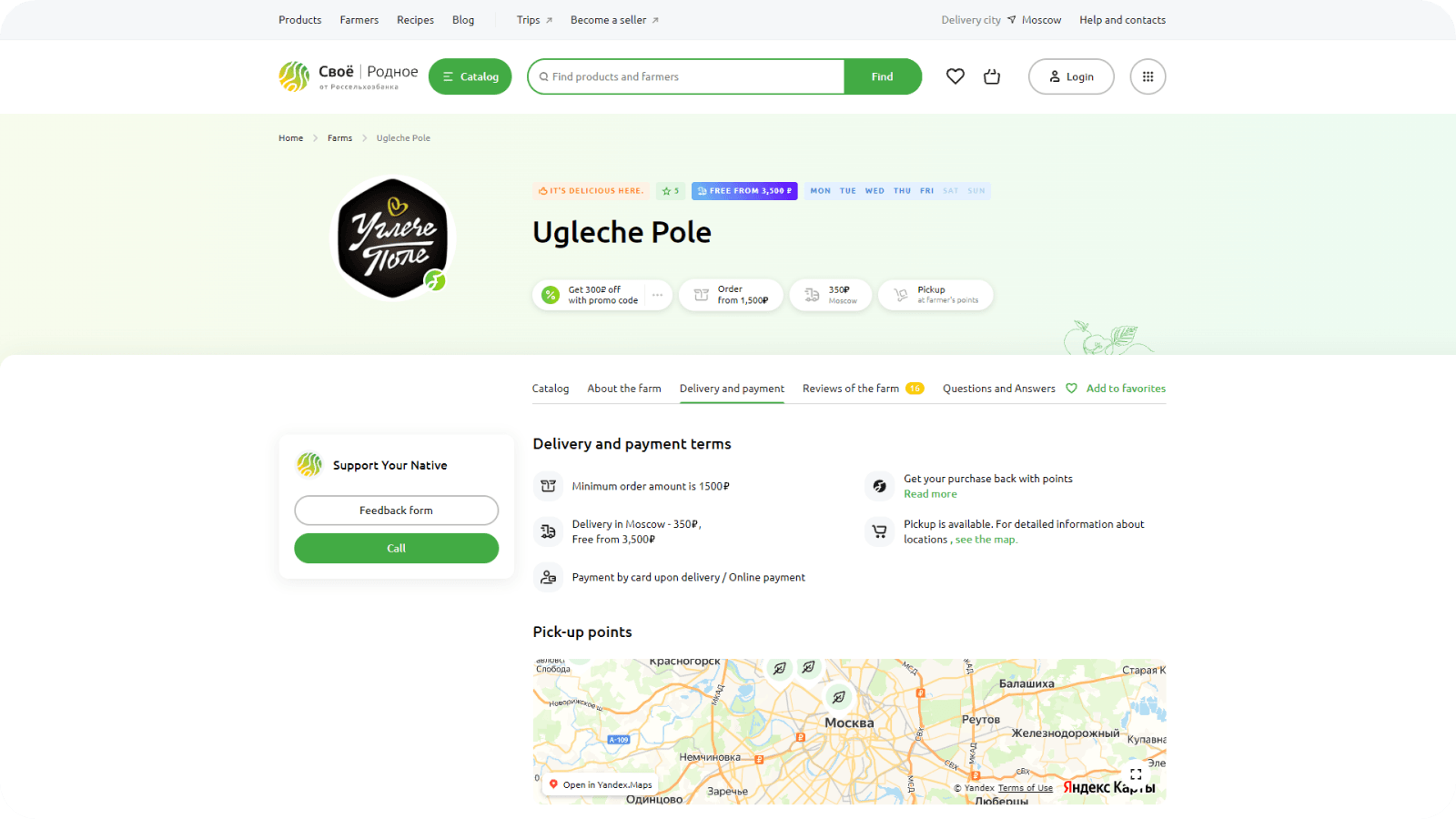
Farmer Page

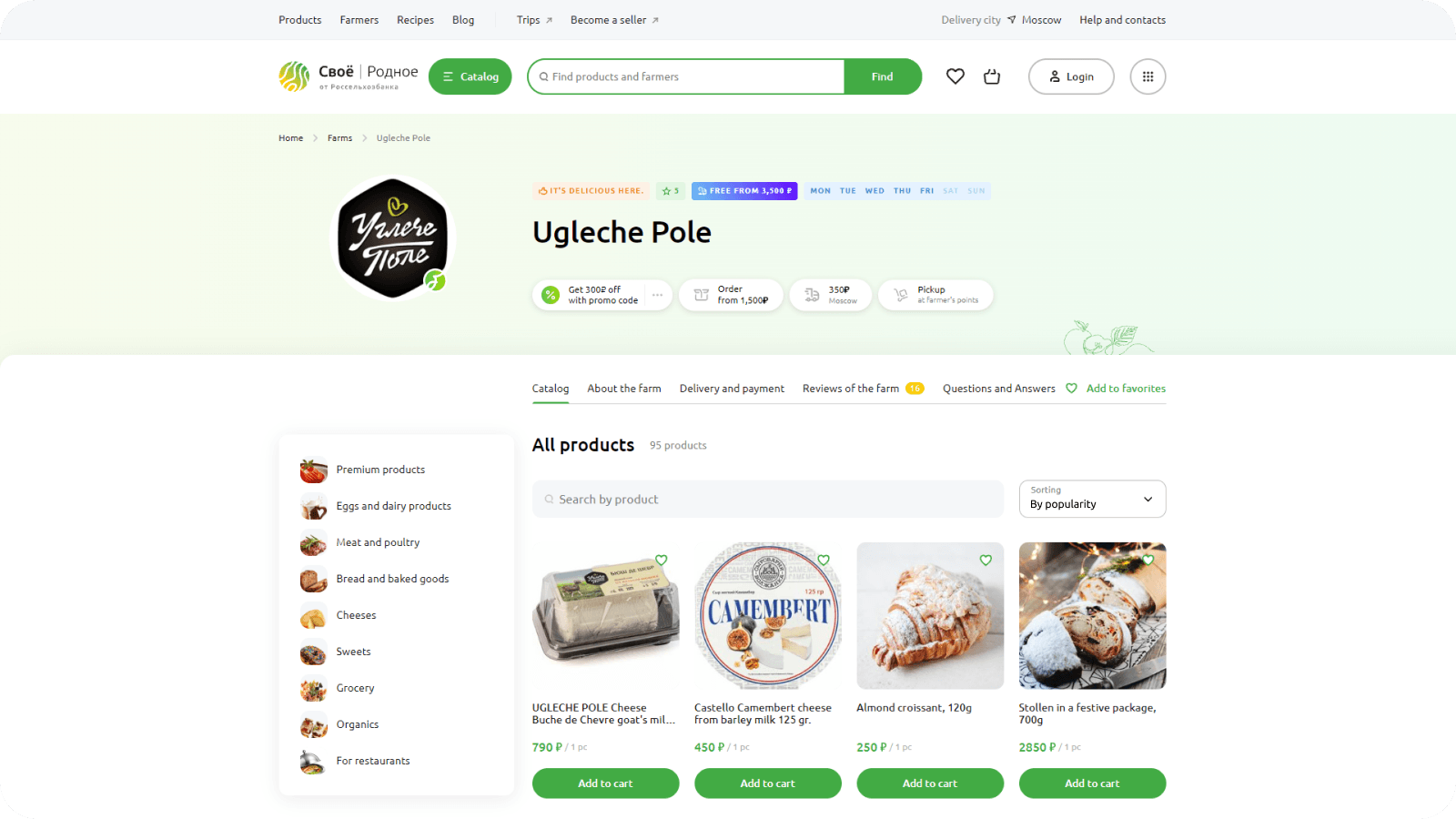
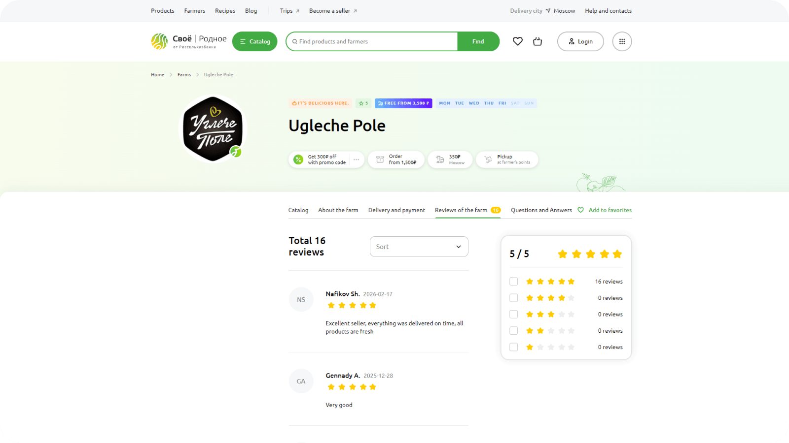
The farmer page became one of our strongest touchpoints. Beyond listing products, it gave customers what they needed to trust the source: working hours, reviews, and a direct line to ask the farmer questions.

That trust translated directly into behavior. Once the page launched, conversion on it more than doubled within the year — becoming one of the strongest drivers of purchase intent on the platform.

Mobile App

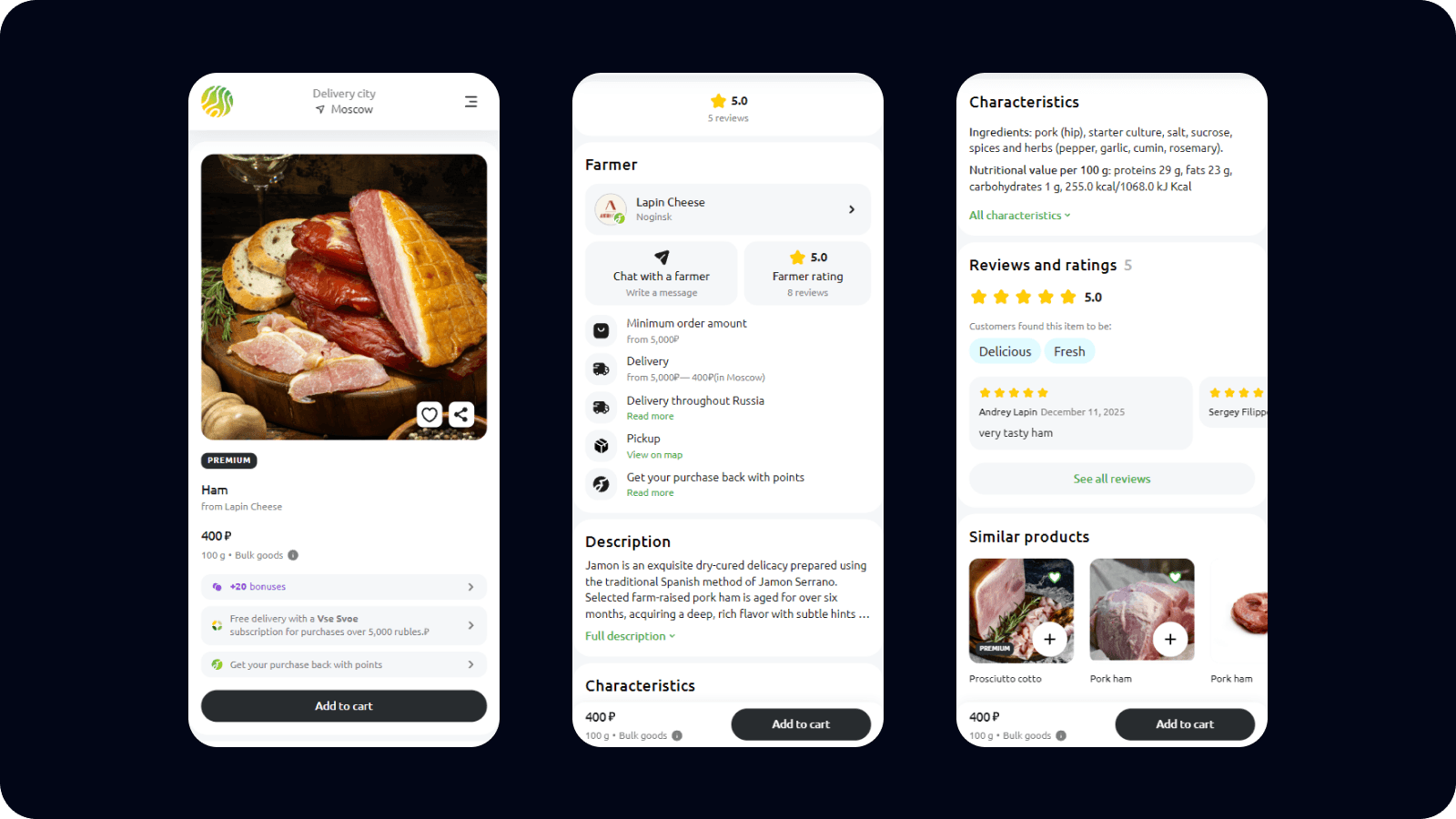
The insight was simple: people order groceries at home, at work, on the commute, or heading out for the weekend, moments a desktop site could never really reach.

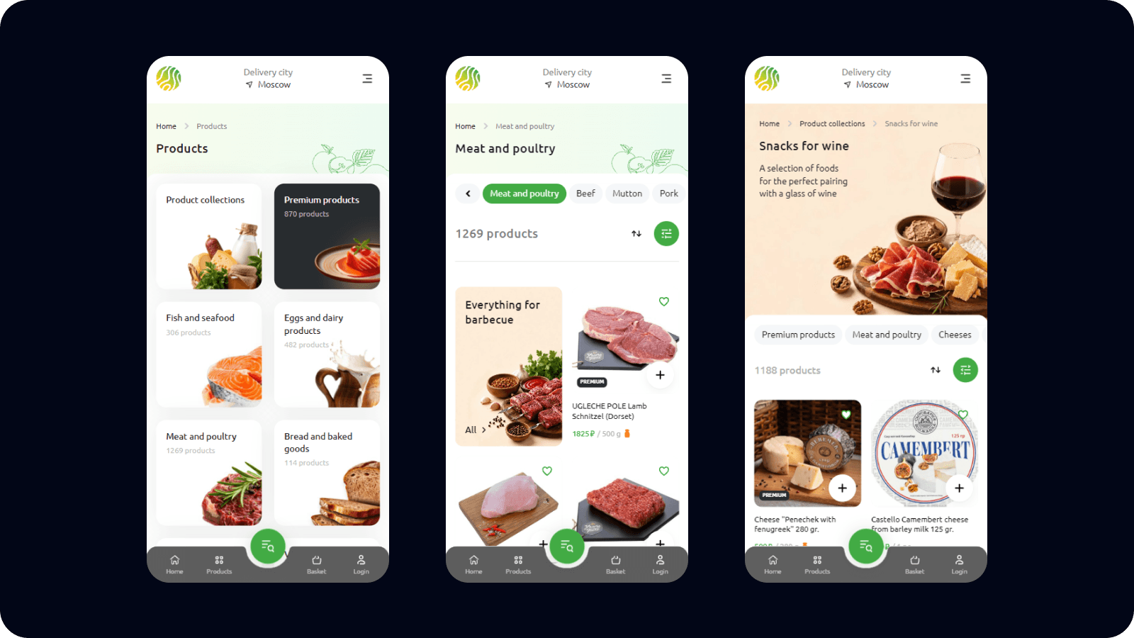
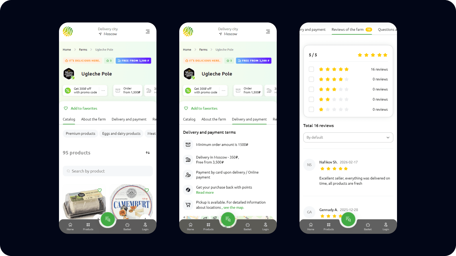
The answer was a mobile app, built on Flutter, which felt like a smart long-term bet at the time. In two months, we shipped an MVP covering the full core flow, catalog to checkout.

Mobile quickly became a real channel in its own right, not a side project, reshaping how we thought about where and when people actually order groceries.

50
Installs, first month
100
Installs, within a year
35
Of all orders

Cooking Up a New Format

This project also built real confidence in trusting my own instincts, and that initiative didn't go unnoticed. On farm visits, farmers regularly fed us their own cooking, and it was genuinely great. That gave me the idea for a whole new direction: farmer recipes.

To test it, I rented gear myself to get a real sense of in-house production cost, shooting, editing, and producing the pilots while our product manager stepped in as the on-camera host. A couple of pilots landed well and launched the format for good.

What We Achieved

Svoe Rodnoe grew into the bank's new flagship product, a cornerstone of the wider ecosystem still forming around it. I got design teams across that ecosystem talking to each other, sharing features and solutions instead of working in isolation, anchored by a monthly open sync where anyone could bring raw work and interesting cases from across the design world.

I also built a unified design system, with a shared core of components alongside room for each product's own edge cases, kept in sync with engineering and checked against Storybook on a regular basis. Working closely with product managers, we shaped a strong roadmap and kept a steady rhythm of syncs on where Svoe Rodnoe was headed next.

The clearest sign of trust came at the end

I was asked to lead something bigger, taking on the redesign of RSHB's business banking platform as Head of Design — the story that follows.